Tatsumeeko Web Improvement
The first launch of Tatsumeeko’s Website 2.0 brought many positive attentions, with Tatsumeeko integrating play-to-earn (GameFi) into the game and offers special digital collectibles known as Meekolony Pass.
However, it also brought conflicting impressions on what kind of game Tatsumeeko is. Seeing as the climate of NFT and Cryptocurrency beginning to have more negative influence due to its volatile nature, it clashes with the players interest - old and new.
Result
Increase of MAU and retention rate
Reduction of bounce rate to 40%
Stronger game branding and minimize friction in site update pipeline
Research Approach
As we’re planning a pre-launch registration and holding an orchestra piece of Tatsumeeko’s BGM in Singapore, we took this opportunity to refresh the website’s focus.
Finding the trends
We asked our users to define what are some of the most important concerns that come to mind about current Tatsumeeko. Those were shortlisted to top 3 judging by the trend:
I still have no idea what is Tatsumeeko? How can I play it?
Is it pay to play? Does it limit a lot of important features behind crypto paywall?
I don’t get what’s the experience look like. Is it an app? But you can also play it through discord bot?
With these questions in mind, the landing page has to answers all the doubts around Tatsumeeko brand as a crossplatform MMO-lite RPG game while still has degree of functionality for the Crypto-leaning audiences.
Comparative Analysis

We take a look at our potential competitors and referencing what works for our scenarios by these criteria:
They’re online mobile games with gacha elements
Has modern magical fantasy and tech-y elements
Is in-development/has pre-launch registration bonus
As much as possible, integrates play-to-earn elements
Analysis Takeaways
Illustration and its composition takes a big role in setting the brand style
Game trailer is usually at the top of the page and used to show what’s the game looks like
Pre-launch sign up must be the second top in landing page’s hierarchy
Any relevance with blockchain made subtle and hidden from the landing page
Roadmap
We wanted to execute the improvement as soon as possible while also looking at the long-term goal, therefore we come to an agreement to chunk it down to two versions: Tatsumeeko 2.5 (short-term) and Tatsumeeko 3.0 (long-term).
This way, while we’re working on the Tatsumeeko 2.5 update with the purpose of maintaining and increasing the retention rate, we’ll also be laying the foundation for the bigger impact which is website version 3.0; the game’s Alpha Release.
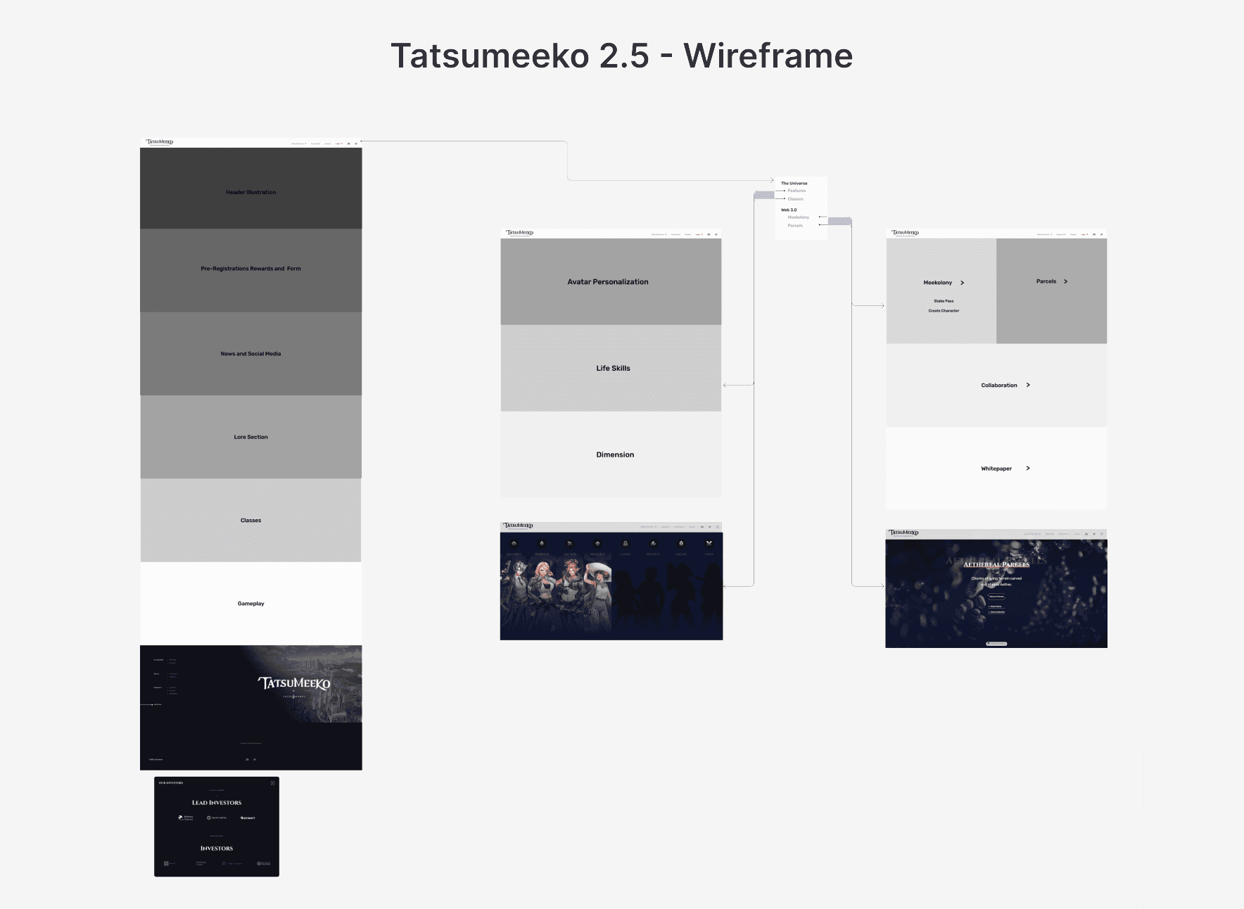
Tatsumeeko 2.5 Objectives
Game previews and section for pre-launch sign up
Publicly reduce the relevancy with Cryptocurrency and NFT to refocus on the game’s original purpose.
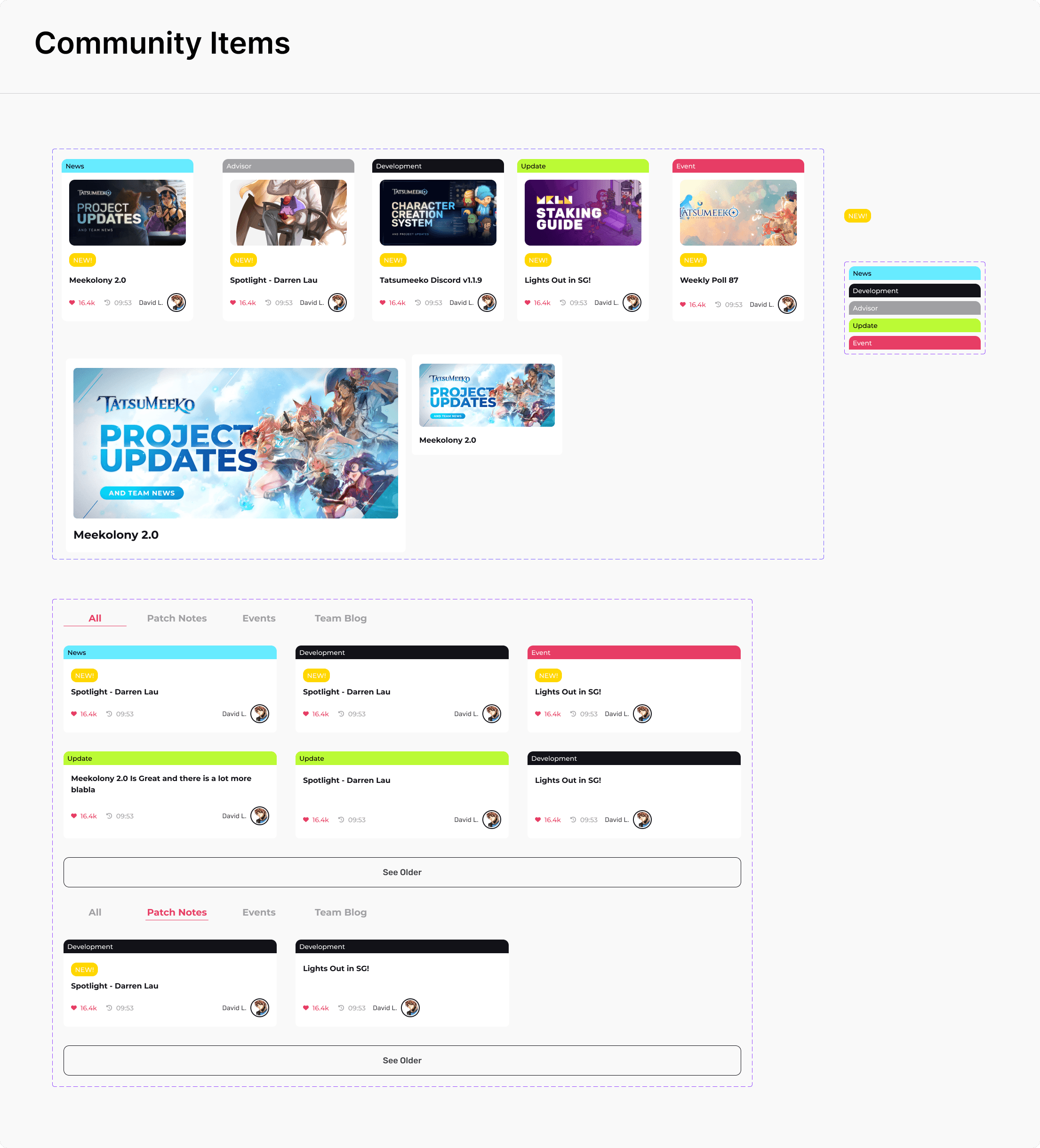
Inclusion of Game’s Classes teaser and News & Updates in the landing page
Make the footer more compact by displaying the investor section in another way
Tatsumeeko 3.0 Objectives
Video trailer of Game’s Alpha Release on the top of the page
Merging of Tatsu.gg and Tatsumeeko, thus redefining information architecture of Tatsumeeko sitemap
Update the Landing Page’s Lore, World, Gameplay, and News & Community’s section
Update UI elements to be more modern-fantasy relevant
Navigation Flow

Wireframe
Design System Updates

Website 2.5 Results
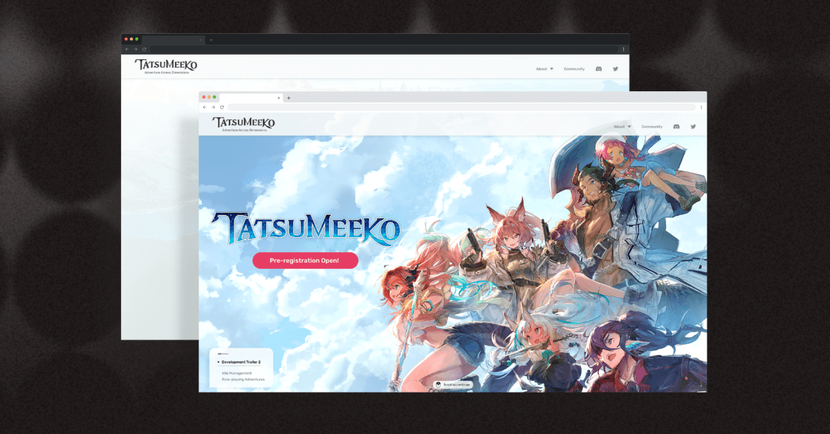
Header, CTA, and Articles
The header and pre-registration are the highlight for Pre-technical CTA when user first see the Landing Page. Since Tatsumeeko's consistently developing until the Alpha Release, we keep users abreast of the update through our Community article as well as grabbing attention of potential users by putting it in the upper section of landing page.
Lore and Games Section
Story section’s made more compact than before
Included Classes’ teaser section to prompt user to check out the Classes page
To keep the CTA, the floating button’s set on the bottom corner to send the user back to the pre-launch registration section.
Responsiveness
Footer Improvement
Previously we included the long list of our investors. It’s however become a problem to navigate with having too much to scroll so I designed it to be a popup instead, making it more compact while still keeping our list of investors.

Other Projects